UX • UI • HTML • CSS • JQUERY • RUBY ON RAILSI joined AboutLocal in its infancy and remained until we were acquired by Groupon for our data, tech, and design.

When our boss took my coworker and I to Bali for two weeks (who ever even gets to say that, right?), we decided to use our Think-Worlds-Outside-The-Box time to redesign the core feature of our product — a stream of social media posts happening at a particular physical location — in order to improve engagement.
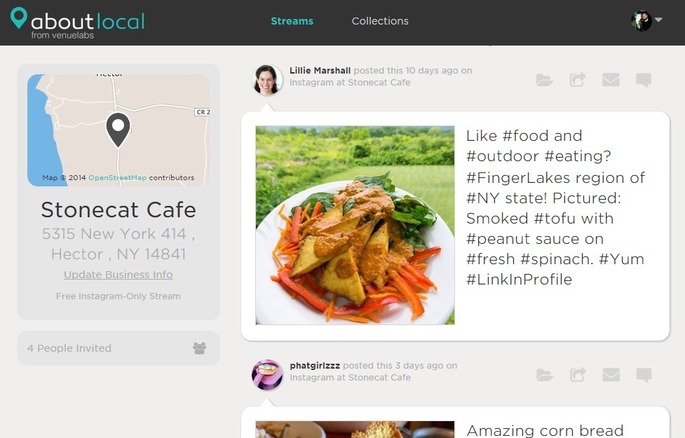
First, we got clear on the user goals for this UI (see what people are saying inside their location and email, repost or reply to the post) and then agreed on some success metrics (more scrolling, more clicking, more activity on each post).
After that, I did some brainstorming on what was lacking in the customer experience that might discourage the behaviors we want, and what we could change that would make those behaviors easier, clearer, and more appealing. We had a lot of metadata about the post and four major actions one could take - but what of these elements were most important? What one thing needs to be primary and what can we make secondary? Can we hide anything?
Once we had a list and hierarchy of elements, I sketched out possible lock-ups, looking for the best way to show or hide the various interfaces in a way that made sense in the context of the site's physicality. I sketch by hand and go straight to coding in the browser or in a branch on GitHub so that we can quickly begin to iterate on a prototype of functional code.
The redesign was a success and our metrics improved quite a bit. We gave much more space to the stories customers were telling about their experiences inside a particular business by visually prioritizing the photo and caption, we made it much more obvious that various actions can be taken on these posts, and we made all secondary information available without letting it distract from the delight of scrolling through posts.