UX • UI • VISUAL • REACT NATIVEArivale helped people improve their health via blood-work analysis, lifestyle tracking, and coaching VIA A MOBILE APP.

Working on the Arivale mobile app, I had an opportunity to design for both Android and iOS devices, to port complex functionality from a web dashboard to a limited space, and to begin to craft new features and styles to improve the mobile experience.
Our first project was to translate our website into a mobile app. Much of the existing look and feel was ported straight from the web (which existed before I joined the team), however there was room for some improvement, and a need for new, custom UI patterns and styles.

Coach Interactions
Our coaching sessions previously only happened via a live phone call, so we wanted to give our members the option of chatting as well. A fairly simple feature for sure, but because we wanted Arivale-specific functionality (creating and sharing meals for example), I had to find a balance between standards set by other popular chat apps as well as design for our members’ needs.
Shown: The coach chat, meal creation page, and a fun feature that didn’t get released called High Fives, which was the seed of us truly tackling motivation and the habit loop in our digital products.
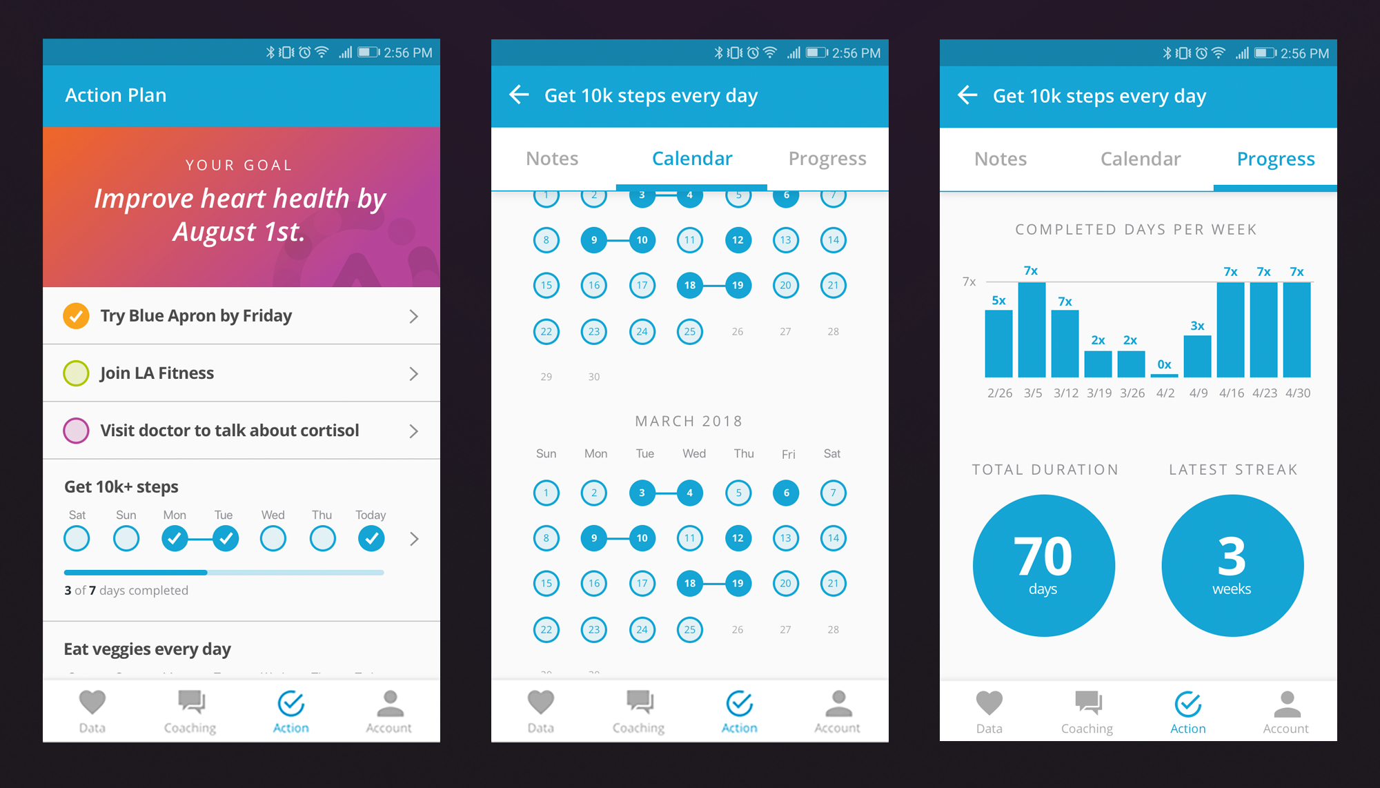
ACTION Tracking
This is the original UI for our “action tracking” feature which allows members to view their health goals and commitments made in service of achieving that goal. Given more dev time, I would have liked to improve on a couple things - in particular, we tried to do too much with each action-as-link (open/close, select days, click through), and while having a bottom-up scrolling calendar page was clever, it would have been simpler to have a left-to-right sub navigation showing one month at a time.
I show evolved concepts for this feature Arivale Blue Sky 1 and Arivale Blue Sky 2.
Shown: Members can view commitments, compliance calendar, and their progress.

lifestyle data
The way we presented blood and lifestyle data to our users on the site (and mobile v1) was hard to interpret and visually unappealing. I took lead on designing new ways to present data to members that were more friendly, easier to understand, had better visual hierarchy, and did a better job at explaining the data without coach intervention.
Shown: A new way to collect self-reported health behaviors, an overview of your average sleep duration and bedtime variability, as well as how your genetics (and their interaction with your lifestyle) may be impacting when and how long you sleep.